It’s no secret — I am a font collector!! I love fonts of all types … script, dingbats, decorative … the list goes on and on! Often downloaded fonts come with both the TTF and the OTF font file … which one should you install? Let’s talk a minute about the difference in these two font formats.
TTF Fonts
True type fonts (TTF fonts) were created by Apple and Microsoft. The idea was to develop fonts that could be used on both platforms, Mac and PC. They work with most printers and can be used in Silhouette Studio, Scan ‘n Cut Canvas and many embroidery software programs.
OTF Fonts
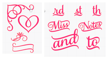
Open type fonts (OTF fonts) were a created as a collaboration between Adobe and Microsoft. They are also cross platform, working on both Mac and PC. OTF fonts have space for more characters (up to 65,000!!) and also provide support for glyphs, ligatures, small caps, alternate characters, old-style figures and catchwords. They also work with most printers and can be used in many software programs, including Silhouette Studio.
OTF Features
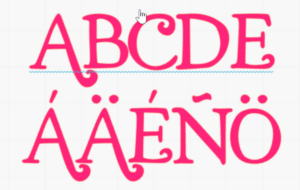
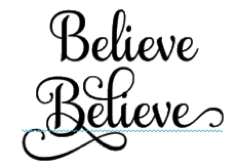
“Glyph” is a word that has come to mean “special characters”. In typography, glyphs are elemental symbols within an agreed set of symbols, intended to represent a readable character for the purposes of writing. The top line shows traditional letters and the bottom line shows glyphs.
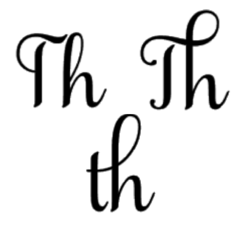
Ligatures are two or more characters combined into one character. They are more common found in script fonts. They have increase in popularity with the advent of desktop publishing.
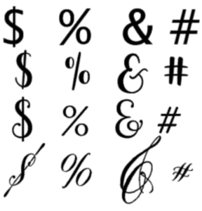
Alternate Characters are non-alphanumeric characters. They are like glyphs for non-alphabetic characters. Examples are $, % and &.
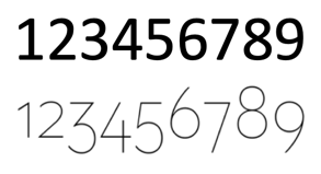
Old Style Figures are numbers that have varying height and alignment. The numbers 6 and 8 have ascenders and the numbers 3,4, 5,7 and 9 have descenders.
Catchwords and Ornaments are stylized words and phrases sometimes included with a font. They also include flourishes and embellishments.
For more about how to use all these special characters, check out this blog post.
This post will tell you all about using alphabet sets (which are not fonts at all but look like them!)
Which to Pick?
Any time you have the option of selecting the OTF font, that’s the one you want! When you are selecting the font to download, check to be sure that the information provided by the creator. Some OTF fonts must be used in Adobe PhotoShop or Adobe Illustrator to take full advantage of all the features. Also some free fonts do not include all the added features even though they are OTF fonts. Take a moment to see what the compatibility and features are before you download a font.
Where to find Fonts
These websites have free fonts. They are often only TTF fonts or are limited OTF fonts. They also are usually only for personal use. That means you will need to go to the developer’s website to purchase the commercial license if you are using the font for business.
- www.Dafont.com
- www.Fontspace.com
- www.1001freefonts.com
- www.Fontsquirrel.com
These websites offer both free and paid fonts. They often include the commercial license, even in the free fonts. They are also frequently OTF fonts with all the bells and whistles.
- www.fontbundles.com
- www.creativefabrica.com
- www.designbundles.com
- www.therhinestoneworld.com
- Silhouette Design Store
PUA Encoded Fonts
PUA stands for Public Use Areas. Fonts that are PUA Encoded allow you to access special characters in Studio and other programs. Non-PUA Encoded Fonts can be used in Studio but will not give access to special characters. Special characters from Non-PUA Encoded fonts can be accessed in other programs such as Illustrator.
A Few More Things
So now you know … whenever possible, pick the OTF font! It will give you the most flexibility and the most extra characters. Remember you can check out how to access all those “glyphs” by clicking here. You will find tips for working with thin fonts by clicking here. And for tips on adding text to a path to create curved or other special shapes with your words, click here for Silhouette Studio and here for CanvasWorkspace.
We’ll talk more about text in an upcoming blog, so check back!!
If you enjoyed these tips, please join my Facebook groups … Libby’s Silhouette Group — Tips, Tricks, Tutorials and Projects, Libby’s Craft and Sewing Group and Running With Sisers – Juliet and Romeo. You can also find me on FB at Libby’s Loft.com. Please join and feel free to ask questions and share your creations! I look forward to seeing you there!!
Until Next Time,
Happy Crafting!!
Disclaimer: Posts on this site may contain affiliate links. Clicking on one of these links or making purchases at linked sites does not mean you pay more for your purchases. It means I may receive a small commission on your purchase. This commission helps defray the costs of this site and enables me to continue to provide you with new and exciting content.
Until Next Time,
Happy Crafting!
Disclaimer: Posts on this site may contain affiliate links. Clicking on one of these links or making purchases at linked sites does not mean you pay more for your purchases. It means I may receive a small commission on your purchase. This commission helps defray the costs of this site and enables me to continue to provide you with new and exciting content.

Good post Libby and you included all the other bells and whistles articles needed for fonts! Thanks for a good beginning to the new year!
You are so welcome, Julie!