Did you fall in love with a beautiful font only to find out the lines are super thin and it’s difficult to cut?? Here are some easy ways to fix that!
Font Families
Some fonts you purchase are part of a font family. This means there are several font within the “family”. All the fonts are based on the main font but have different characteristics and each one is installed on your computer separately. This font, Black Star, has six different fonts included in the family.
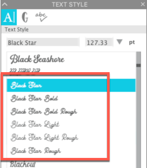
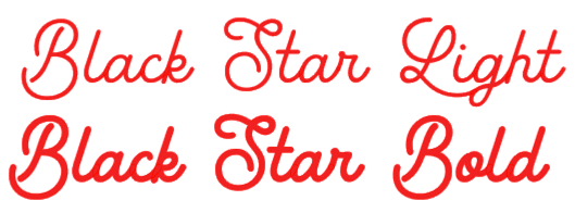
So in this case, simply selecting Black Star Bold instead of Black Star Light will keep the flowing lines I loved in this font but add some thickness to make it easier to weed. Making your letters a little thicker will also give you more adhesive touching the blank and help the vinyl stick better … longer.
Font Styles
“Font” and “typeface” are often used interchangeably. However, they are slightly different. A typeface is the primary design for a group of characters. The font is the implementation and variation of the typeface …. such as bold, or italic. These interpretations are also called styles.
In Silhouette Studio, you can see the styles available for each font in the font panel.
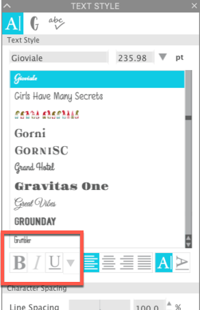
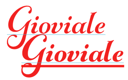
When a font has additional styles available, the icons for Bold, Italic and/or Underline will be active. Simply selecting one will change the font style. Here I changed the style to Bold and Underline.
Offset
If the font you want to use does not have a bold font style or is not part of a family with a bold option, then you can still get a bolder version of your font using an offset.
With your lettering selected, right click and select Duplicate. Move the duplicate copy off the mat area. I do this as a “just in case” so if I don’t like the results I get, I can always go back to my original text. With the text on the mat selected, click on the Offset icon. In the Offset panel, select Offset. In the Distance box, change the distance. I used 0.03 inch first. Click Apply.
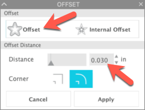
Before you click anywhere else, use the keyboard shortcut CTRL/CMD+G to group the parts of the offset. Change the color of the offset by clicking in the Fill Color icon in the Quick Access Toolbar.
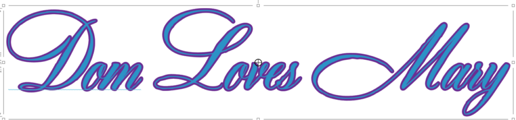
Left click and drag the original text out of the way and check your new text.
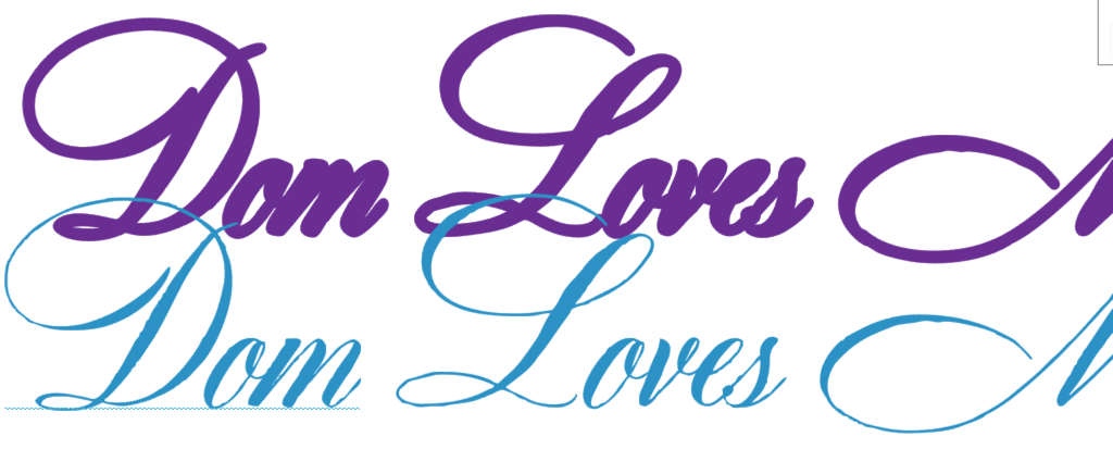
I don’t like the thickness of the 0.03 inch offset for this font. I deleted the offset and tried again, using 0.02 and also 0.01 inch values. Here are the results.
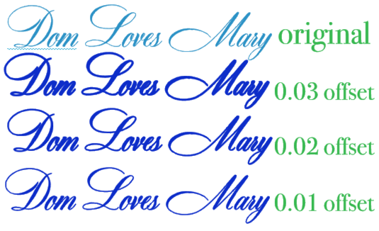
Which do you like best? I like the 0.01 inch offset in this case. Remember when you create the offset that your text is no longer editable text … it is an image that looks like text. That’s one reason I like to make that extra copy of the text before I create any offsets.
So there you have it … three ways to increase the thickness of a font. And best of all, each of these methods of increasing font thickness is available in the basic version of Silhouette Studio!!
If you enjoyed these tips, please join my Facebook groups … Libby’s Silhouette Group — Tips, Tricks, Tutorials and Projects, Libby’s Craft and Sewing Group and Running With Sisers – Juliet and Romeo. You can also find me on FB at Libby’s Loft.com. Please join and feel free to ask questions and share your creations! I look forward to seeing you there!!
Until Next Time,
Happy Crafting!!
Disclaimer: Posts on this site may contain affiliate links. Clicking on one of these links or making purchases at linked sites does not mean you pay more for your purchases. It means I may receive a small commission on your purchase. This commission helps defray the costs of this site and enables me to continue to provide you with new and exciting content.
Until next time,
Happy Crafting!!
Disclaimer: Posts on this site may contain affiliate links. Clicking on one of these links or making purchases at linked sites does not mean you pay more for your purchases. It means I may receive a small commission on your purchase. This commission helps defray the costs of this site and enables me to continue to provide you with new and exciting content.